Welcome

Welcome to my As Foundation Portfolio. Here you will find research and planning, construction evidence and evaluation for my foundation portfolio.

Tuesday, 31 January 2012

Peer Assessment of Flatplan

Peer Assessment comments

Positives

  • Good layout
  • Awareness of centrefold 
  • Genre is obvious
  • Consistency throughout the pages

Negatives
  • There isn't enough text 
  • Too much free space
  • Make the magazine more fuller 
  • Make the masthead bigger

    Modifications I will make to my own work:
    • I will make my pages look more full with less free space by correcting the layout
    •   From the comments I will also add some more text to try an achieve the correct balance between text and images

      Monday, 30 January 2012

      Flat Planning

      This is a flat plan for the front cover of my music magazine. I have chosen to only use one image which is my model in the centre of the page looking directly at the camera to show the main feature of the magazine. I struggled to make my flat plan exactly how I wanted it but it is the idea of what I want my magazine to look like. Although on my flat plan the model is quite small and low on the page I will place the image higher up to make sure my magazine doesn't look empty. The background of my magazine will be plain to make my model standout but I will fill in any extra gaps with sell lines. My main colours are pink and black, I have used them because I think they sends out a bold and clear message. I have used pink because it meets my target audience of students that are mainly girls. I have used the colours pink and black throughout my magazine and front cover this is to keep it simple and it will be easier to recognise the magazine. I have placed my main sell line across the bottom of the front cover to draw the readers attention. I have also used capital letters to make it bolder and so the reader knows who the main feature of the magazine is.  All of my sell lines will be eye catching to make the reader want to buy The Beat magazine. I have also placed a sell line in a heart shape to make the magazine more appealing. In the bottom right hand corner of my magazine is the bar code and price.


       This is a flat plan of my contents page. I have kept the background of my magazine plain the same as my front cover, I have also carried through the same colour scheme of pink and black. I have called the contents page "Inside The Beat" as I think it makes my magazine different and interesting from the usual title of contents. I have separated the the contents of my magazine into two sections "News" and "Reviews" this is to keep the magazine neat and organised. The page numbers are pink and black I will make sure they standout to make it easier for the reader. There will be three images placed down the right hand side of my magazine they will be framed and tilted to make them more eye catching. I have made a column on the left hand side of my magazine. In the column will include "The Charts" which will display the latest top 10 songs of that week. There is also a section at the bottom of my magazine which has information on subscription.


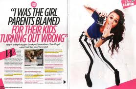
      This is a flat plan for my double page spread. There is a main image of my artist on the left page the image will be feminine to match the target audience of my magazine.  I have also included a quote to make my magazine realistic the quote  will also make the reader want to read the article.  The title of my magazine will be in capital letters and the colours  pink and black which  is the theme of my magazine. I have put my article into 2 columns this could change to 3 depending on how much writing I will include. I am going to make my article a question an answer session to make the magazine professional and so the reader knows what the artist is talking about. The colours of the font will be pink and black. I will keep the same font throughout my magazine to keep it simple and less confusing. I have used a quote in the middle of the page to sell the article to make sure the reader wants to read it.           

      Primary audience research

      I conducted some primary research in order to
      • Find out what appeals to my target audience
      • To discover any plans or potential improvements that could be made to my magazine genre.
      • To identify any gaps in the market and place a refreshing new twist on the genre


      These are the chosen products that I conducted my research on. These are the questions I asked my sample of people.

      1. What genre do you think the magazine pages are ?
      2. Do you like the colours used?
      3. Do you like the layout of the pages?
      4. What content do you think should be featured?
      5. What on the front cover grabs your attention?
      6. If you could change something what would it be?
      7. What do you think when you see the double page spread?
      8. What 3 things do you like about the contents page?
      9. Do the pages standout?
      10. Do you like the themes used?

      From the research I did with a selective sample for my target audience I found that my magazine will be mainly aimed for girls and younger people.


      I have got four opinions on what they think of my magazine research,  I have done this to get a critical opinion on a front cover, contents page and double page spread from a pop magazine. The feedback is helpful in creating my own magazine so I can design a magazine that my target audience will like. These video's have shown me that they like the front cover but the contents page could be changed to make it more interesting. They also show that bright colours and usually pink this represents my genre of pop so I will therefore use this in creating my own magazine. They also think the latest artists and bands are featured in a pop magazine I will apply this when creating my pop magazine.  Another decision I have made is to use a girl model as this is what my feedback relates with a pop magazine. In creating my magazine I will also have a house style to keep it simple and recognisable. 

      Tuesday, 24 January 2012

      Research into a potential target audience - secondary

      http://www.slideshare.net/Aaliyah195/billboard-magazine-analysis - 23/01/12

      Billboard Magazine


      This is a reader profile for Billboard magazine it shows their average reader is people how are interseted in the latest music charts. I think the magazine is aimed for girls who are students aged between 15 and 21. I think the readers will be interested in pop and the latest bands and artists. The magazine targets its audience because it uses bright colours and a language they would understand.
      • They have presented thier reader profile with images to display what the magazine looks like and the themes used to encourage potential advertisers.
      • They have included a range of information so potential advertisors know what thier target market and to encourage them to buy advertising space in BIllboard magazine.
      My target audience is going to be the same I aim to produce my magazine for younger readers aged from 15 to 21. My magazine will be mainly aimed towards females who are interested in pop. My magazine will be aimed for people who like the latest music and enjoy reading magazines in thier spare time. 


      Here is another reader profile for a magazine called mixmag. This explains what the average reader is and what their magazine is about. 

      Monday, 23 January 2012

      Research into institutions that distribute similar products

      NME


      http://www.mediauk.com/owners/40/ipc-media 19/01/2012


      http://www.ipcmedia.com  19/01/2012


      Range of magazines by IPC media: 


      Look
      Now
      Teen Now
      Soap Life
      TV Times
      Bird keeper
      Amateur Gardening 


      The only media interest for IPC media is magazines they only produce one music magazine which is NME. They do produce a range of magazines from one distributer this is to reach out to different types of readers by producing magazines for each genre.  IPC media might be interested in adding my magazine to the list of their titles because my genre is Pop and they don't produce anything like it as the only music magazine they produce is NME. It is different because it will be aimed to a different target audience compared to what they already produce this will expand their range of readers.      

      Kerrang

      http://www.mediauk.com/owners/88/bauer-media

      http://www.kerrang.com/    24/01/12

      Range of magazines:

      Heat magazine
      Grazia
      Empire
      FHM
      MOJO
      Bella Cook Book

      Other Interests:
      Classic car weekly (newspapers)
      Heat (radio)
      Kiss (radio)
      Magic AM (radio)

      Baur Media produce other music magazines such as MOJO and Pop one distributor would publish more than one magazine because to cover a wider range of readers and genres. I think Baur Media would be interested in adding my magazine to thier titles because they dont have a music magazine quite like mine. It is different because the pop magazine they produce also contains contempory art and fashion as my magazine will be purley be about the latest pop music in the charts.


      Wednesday, 18 January 2012

      Ideas and Feedback


      Feedback 

      Siobhan MacDonald

      "I think you ideas are good and I like the genre of the magazine. You need to start thinking of what colours you would use and where the masthead would be placed. I like that you want to keep the magazine simple and neat but I would give your magazine a twist to make sure it is interesting. You could also think about where you are going to place your model on the page and what type of language you will use. " 

      Research into similar products

      I have used the Internet to research music magazines. I have analysed music magazine front covers, contents pages and double page spreads. I have also included information on house style.


      Thursday, 5 January 2012

      Brief

      I am going to research and create a contents and a double page spread of a music magazine.


      Preliminary exercise: using DTP and an image manipulation program, produce the front page of a new music magazine, featuring a photograph of a student in medium close-up plus some appropriately laid-out text and a masthead. Additionally candidates must produce a DTP mock-up of the layout of the contents page to demonstrate their grasp of the program.

      Main task: the front page, contents and double page spread of a new music magazine.
      All images and text used must be original, produced by the candidate, minimum of FOUR images per candidate.