Welcome

Welcome to my As Foundation Portfolio. Here you will find research and planning, construction evidence and evaluation for my foundation portfolio.

Thursday, 1 March 2012

My article

At only 18 years old Bethany Allison the latest, freshest pop star for 2012 is now releasing her first debut album and we have gone backstage to have an exclusive interview with her.

We are backstage at the Pop festival how does this make you feel?
I can’t believe I am performing in front of hundreds of people at one of the biggest festivals in the UK. If someone had said to me in 2 years time you will be performing at the Pop festival I wouldn’t believe them.

How would you describe your first debut album?
My new album is called “Believe” it is a mix of ballads, dance and upbeat pop sounds which will hopefully appeal to a lot of my fans. I have tried to include something for everyone in my album from classic pop to ballads.

 What genre of music do you produce?
The genre of my music is mainly pop with a slight dance theme. I love pop music as it makes you feel good and I can relate to my fans through my music.   

Who is your favourite Pop artist and have they influenced your own music?
My favourite pop artist is Adele because her music never fails to inspire me; she uses real life situations in her songs that have a true meaning. I hope I can go onto reach my fans in the same way.  

Your first single “Nothing like me” went to number 3 in the music charts this must make you feel proud?
I am extremely proud to have my first single in the top ten it is a dream come true. Knowing that people love my music defiantly makes me happy.

People call you the Pop Princess why do you think this is?
I am not sure, I love the name! I suppose it is because I am only young and have a strong passion for pop. And for them to see me as a princess is really rewarding.

Where is your favourite place you have performed at and Why?
My favourite place has to be the Newcastle Metro radio arena as it is in my native North East and the fans are fantastic and always make me feel glad to be back home.

Who do you aspire to be like and why?
I aspire to be like Cheryl Cole as she is from the North East like myself, she started performing at a young age and has grown into a well known artist.

You are also going on tour are there any surprises in store?
I don’t want to give too much away but there will defiantly be lots of colour, sparkle and a sneaky surprise guest! It will be defiantly worth coming along to see!

For more exclusive interviews and videos clips visit our website www.thebeatmagazine.co.uk.

Monday, 20 February 2012

Research and Planning feedback

Action Plan

I intend to meet my deadlines by working hard in class to make sure I complete all my work by the set dates. I will also work outside of class if needed to make sure I meet the deadlines given to me. To make sure I meet my first deadline on the 5th March I will use some of my free lessons to get my photographs taken of my models therefore this will give me more time in lesson to construct my magazine.  I will also make sure I complete at least one task each lesson to meet my deadlines.

Production Update

I have 6 weeks until easter holidays, this means I have 4 weeks for construction of my music magazine.


  • My first deadline for the first draft of my final product is Monday the 5th March. 
  • My next deadline for the final product with all corrections made is Monday the 19th March. 
  • I will be working on 7 evaluation questions between Monday the 19th and Friday the 30th March.
  • My final deadline for my completed portfolio is Monday the 16th April.
 

Friday, 10 February 2012

Model Costume, Make Up and Props

Costume and Make Up Research


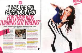
This is an image of an artist who falls into the same genre of my music magazine, the image was taken from We Love Pop magazine which is the same genre (pop) I wanting to create. Her costume is simple but but bold enough to standout to the reader. Her costume is edgy with black and white striped jeans to try and give a certain impression to the reader. This image is taken from a double page spread as I am going to use a female artist on my double page spread too, I will try and using the same costume techniques to create a fun, bold vibe to the reader.


For my models make up I have researched what a typical female pop artist would wear. From my research I have found the make up is normally quite simple to give off a feminine feel. The make up isn't normally bold and bright because this doesn't fit into the genre of pop. Above is example of what I think a pop artist would wear for a photo shoot I got this image from google. It is blue with white eyeshadow which is used together to make it less harsh and blend in with the whole image. They have also used eyeliner to define her eye and make it more noticeable.


Above is an image of me applying make up to my model. I decided to go with a girly colour to match with my genre of pop which is a light pink which isn't to visible in this photo. I have used this colour because it is feminine and isn't to bold.   


Here is another image of one of my models I have used blue and green eyeshadow to make her eyes standout. I have tried to create something similar to what I have researched as shown on the first make up image. I have also used eyeliner as this will add more of an definition to her eyes and will create an edgier look.


This is an image of my model having her hair curled. I have chosen to curl her hair because it will make the image really girly and professional.


I have also included an image of a costume I might use to feature in my magazine. It is edgy but stylish and will hopefully create the image I am looking for.  I have chosen patterned leggings because they are the latest fashion and relate to my genre of pop it also makes her costume more bold and interesting. The colours are quite simple but I think it will make they image standout more on the page.      

Test shots


For this image I have taken a close up portrait shot of one of my models in the studio with a black background. I have directed her to look straight into the camera to address the readers. She is smiling to try and create a fun happy effect. I think this image will be suitable to use in my contents page as a close up of the main feature of the magazine. I like this image but when I take my final photographs I will try and use different expressions.


This image was also taken in the studio because this is my chosen location, it is a portrait medium close up. Her hands are placed on her hips to make the image look less serious she is also smiling to make the image more natural and less posed. The white top stands out well from the background and makes her costume more noticeable. For my real photographs I will try and have a white background in the studio to make he hair standout more and the image will be easier to use.   


In this image I have directed my model to put one hand on her hip this is to make the pose more appealing and to make the photograph standout from the page. This image is a portrait medium close up which means it would be suitable for both the front cover and the double page spread. She is also wearing a colourful scarf to add more colour to her costume and to make it more attention grabbing.  I like this pose because it make it fun and girly which is the image i am trying to get across to my readers.


For this image I have tried a different angle from the others to get a variation. It is another medium close up as I think it goes well for a front cover or double page spread. I have tried to make this image a little more serious which is reinforced be her pose of crossing her arms this is to make the magazine have more edge but to keep the theme of a pop magazine.  

Wednesday, 8 February 2012

Model Call sheet

Below is a call sheet for the models I am going to use in my magazine. The call sheet includes a picture of each model to identify how they are, shooting information, role and location. It also makes sure all my models have signed their model release form. This means I have permission to use them for my photography, publish it online and print the photographs.

Call sheet


Actor : Rebecca Humphery
Character : Photography model
Release form signed? : Yes

Shooting day : 21/02/2012
Location : Darlington
Producer : Laura Choppin
Director :  Laura Choppin

Actor : Bethany Allison
Character : Photography model
Release form signed? : Yes

Shooting day : 21/02/2012
Location : Darlington
Producer : Laura Choppin
Director : Laura Choppin


Actor : Natalie Sprentall
Character : Photography model
Release form signed? : Yes

Shooting day : 21/02/2012
Location : Darlington
Producer : Laura Choppin
Director : Laura Choppin


Actor : Siobhan Macdonald
Character : Photography model
Release form signed? : Yes

Shooting day : 21/02/2012
Location : Darlington
Producer : Laura Choppin
Director : Laura Choppin

Recce of Location

Model release forms

Below are my model release forms this gives me permission to use the photographs I take of them. It also means I can publish them online and print them off. 


.

Risk and Hazard assessment


These are my risk and hazard assessment forms that I have filled out show the risks and hazards that might take place in the studio. I also completed another form which explains what I am going to do to prevent these risks and hazards from happening.

Tuesday, 7 February 2012

Inspirational images moodboard


This is a collection of  images I have found inspirational for my music magazine. I have chosen a selection of images that I think suit the genre of my magazine which is pop.  The images are all female as I think this suits my target audience. The images are inspirational because the poses are what I would like to see in my music magazine. When I take my photographs I will make sure I give my models direction to try and get the images I am looking for. Also all of the images were taken in a studio rather than location I think this matches my genre well and they all look professional. Also the clothing that the models are wearing are inspirational they are all feminine and stylish. This has inspired me to select feminine but fashionable clothing for my models to wear for the photo shoot.

Sunday, 5 February 2012

Image Analysis And Composition

Her eye line is looking directly at the camera with her head looking over her shoulder.
Her eye makeup is dramatic.
Her mouth is pouting which gives an edgier feel.
Her head is tilted down to the side with her eyes looking straight at the camera to make the image alluring.
She is in the centre of the image and it is a close up.   
The background is plain which makes the artist  stand out more.
Their body language is confident and all of their eyes are looking directly at the camera.
The lighting is made so their faces and features stand out.
They are all wearing black and grey which gives a rebellious feel.
Their eyes are looking directly into the camera which shows their confidence.

They all  have serious facial expression to look mature and sophisticated.

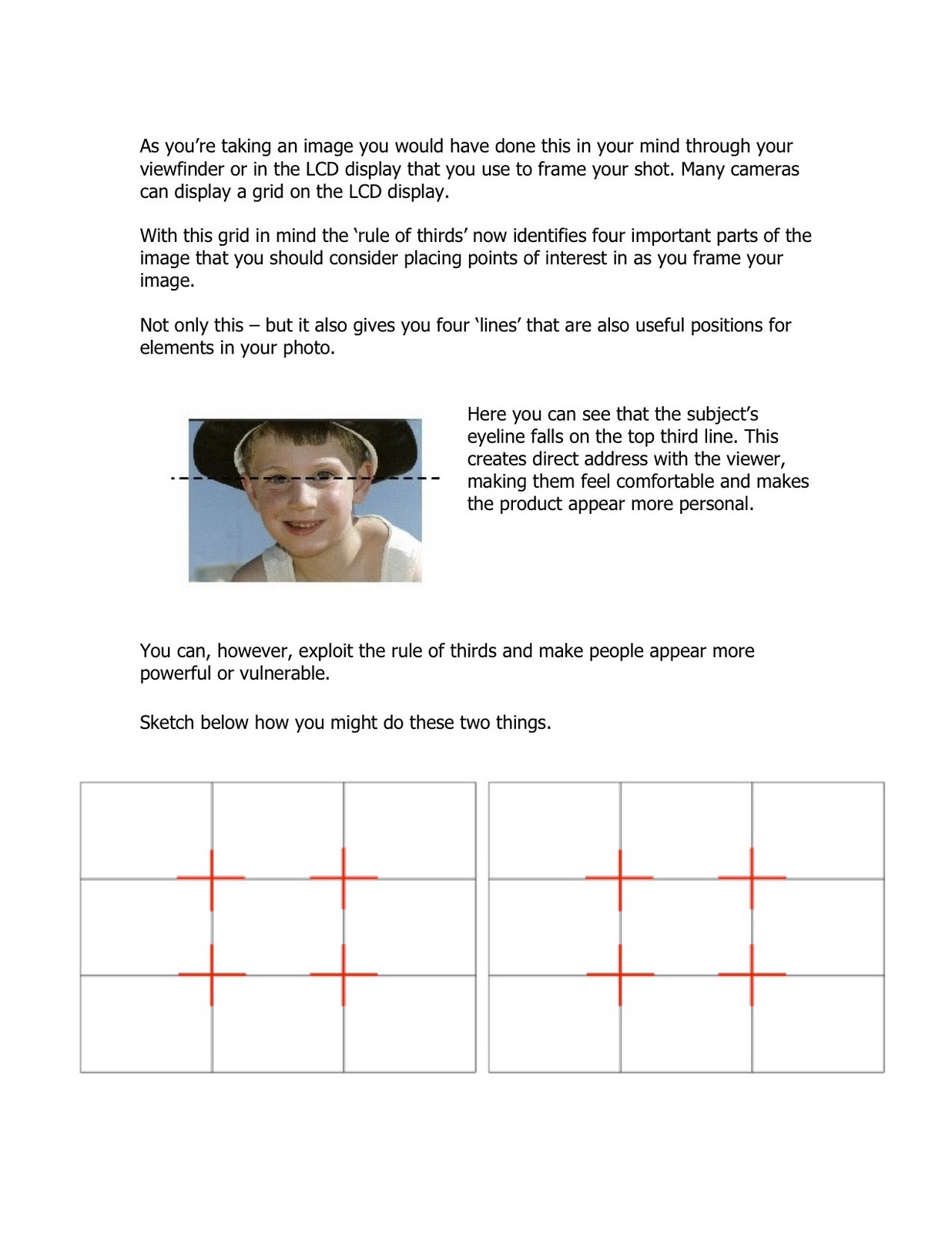
This research has influenced my idea for my magazine because I have learnt that eye contact with the camera is very important. I will make sure my model looks directly into the camera and I will use the rule of thirds. I will also give my model direction to make sure I get a variety of poses and the vibe I am looking for, for my magazine. I think I will take all of my photos in a studio to get the professional look I want for my magazine it will also match my genre. The costumes for my models will be feminine and fashionable to relate to my genre of pop.

Flat plan improvements


After the peer assessment of my flat plans and the feedback I received I have improved my flat plans to make them look more professional and and complete. I have tried to fill up any spare gaps to make my magazine look more full and exciting. I have also made the masthead bigger to make it standout from the other text used on the page. Also due to my feedback I have tried to create a correct balance between image and text.

Thursday, 2 February 2012

Constructing an article

The type of introduction I am going to use for my magazine is an interesting one to keep the reader engaged and to make sure they want to read more. I also think an interesting introduction will be easier to write.

I am going to write my article introduction in 3rd person.  I have chosen to write the introduction in 3rd person as I think this will be the easiest way. The rest of my article will be set out as questions and answers.     I have chosen to do this as I think it makes the article easier to read it also makes the reader want to read it because they wont be overwhelmed with text.

Tuesday, 31 January 2012

Peer Assessment of Flatplan

Peer Assessment comments

Positives

  • Good layout
  • Awareness of centrefold 
  • Genre is obvious
  • Consistency throughout the pages

Negatives
  • There isn't enough text 
  • Too much free space
  • Make the magazine more fuller 
  • Make the masthead bigger

    Modifications I will make to my own work:
    • I will make my pages look more full with less free space by correcting the layout
    •   From the comments I will also add some more text to try an achieve the correct balance between text and images

      Monday, 30 January 2012

      Flat Planning

      This is a flat plan for the front cover of my music magazine. I have chosen to only use one image which is my model in the centre of the page looking directly at the camera to show the main feature of the magazine. I struggled to make my flat plan exactly how I wanted it but it is the idea of what I want my magazine to look like. Although on my flat plan the model is quite small and low on the page I will place the image higher up to make sure my magazine doesn't look empty. The background of my magazine will be plain to make my model standout but I will fill in any extra gaps with sell lines. My main colours are pink and black, I have used them because I think they sends out a bold and clear message. I have used pink because it meets my target audience of students that are mainly girls. I have used the colours pink and black throughout my magazine and front cover this is to keep it simple and it will be easier to recognise the magazine. I have placed my main sell line across the bottom of the front cover to draw the readers attention. I have also used capital letters to make it bolder and so the reader knows who the main feature of the magazine is.  All of my sell lines will be eye catching to make the reader want to buy The Beat magazine. I have also placed a sell line in a heart shape to make the magazine more appealing. In the bottom right hand corner of my magazine is the bar code and price.


       This is a flat plan of my contents page. I have kept the background of my magazine plain the same as my front cover, I have also carried through the same colour scheme of pink and black. I have called the contents page "Inside The Beat" as I think it makes my magazine different and interesting from the usual title of contents. I have separated the the contents of my magazine into two sections "News" and "Reviews" this is to keep the magazine neat and organised. The page numbers are pink and black I will make sure they standout to make it easier for the reader. There will be three images placed down the right hand side of my magazine they will be framed and tilted to make them more eye catching. I have made a column on the left hand side of my magazine. In the column will include "The Charts" which will display the latest top 10 songs of that week. There is also a section at the bottom of my magazine which has information on subscription.


      This is a flat plan for my double page spread. There is a main image of my artist on the left page the image will be feminine to match the target audience of my magazine.  I have also included a quote to make my magazine realistic the quote  will also make the reader want to read the article.  The title of my magazine will be in capital letters and the colours  pink and black which  is the theme of my magazine. I have put my article into 2 columns this could change to 3 depending on how much writing I will include. I am going to make my article a question an answer session to make the magazine professional and so the reader knows what the artist is talking about. The colours of the font will be pink and black. I will keep the same font throughout my magazine to keep it simple and less confusing. I have used a quote in the middle of the page to sell the article to make sure the reader wants to read it.           

      Primary audience research

      I conducted some primary research in order to
      • Find out what appeals to my target audience
      • To discover any plans or potential improvements that could be made to my magazine genre.
      • To identify any gaps in the market and place a refreshing new twist on the genre


      These are the chosen products that I conducted my research on. These are the questions I asked my sample of people.

      1. What genre do you think the magazine pages are ?
      2. Do you like the colours used?
      3. Do you like the layout of the pages?
      4. What content do you think should be featured?
      5. What on the front cover grabs your attention?
      6. If you could change something what would it be?
      7. What do you think when you see the double page spread?
      8. What 3 things do you like about the contents page?
      9. Do the pages standout?
      10. Do you like the themes used?

      From the research I did with a selective sample for my target audience I found that my magazine will be mainly aimed for girls and younger people.


      I have got four opinions on what they think of my magazine research,  I have done this to get a critical opinion on a front cover, contents page and double page spread from a pop magazine. The feedback is helpful in creating my own magazine so I can design a magazine that my target audience will like. These video's have shown me that they like the front cover but the contents page could be changed to make it more interesting. They also show that bright colours and usually pink this represents my genre of pop so I will therefore use this in creating my own magazine. They also think the latest artists and bands are featured in a pop magazine I will apply this when creating my pop magazine.  Another decision I have made is to use a girl model as this is what my feedback relates with a pop magazine. In creating my magazine I will also have a house style to keep it simple and recognisable. 

      Tuesday, 24 January 2012

      Research into a potential target audience - secondary

      http://www.slideshare.net/Aaliyah195/billboard-magazine-analysis - 23/01/12

      Billboard Magazine


      This is a reader profile for Billboard magazine it shows their average reader is people how are interseted in the latest music charts. I think the magazine is aimed for girls who are students aged between 15 and 21. I think the readers will be interested in pop and the latest bands and artists. The magazine targets its audience because it uses bright colours and a language they would understand.
      • They have presented thier reader profile with images to display what the magazine looks like and the themes used to encourage potential advertisers.
      • They have included a range of information so potential advertisors know what thier target market and to encourage them to buy advertising space in BIllboard magazine.
      My target audience is going to be the same I aim to produce my magazine for younger readers aged from 15 to 21. My magazine will be mainly aimed towards females who are interested in pop. My magazine will be aimed for people who like the latest music and enjoy reading magazines in thier spare time. 


      Here is another reader profile for a magazine called mixmag. This explains what the average reader is and what their magazine is about. 

      Monday, 23 January 2012

      Research into institutions that distribute similar products

      NME


      http://www.mediauk.com/owners/40/ipc-media 19/01/2012


      http://www.ipcmedia.com  19/01/2012


      Range of magazines by IPC media: 


      Look
      Now
      Teen Now
      Soap Life
      TV Times
      Bird keeper
      Amateur Gardening 


      The only media interest for IPC media is magazines they only produce one music magazine which is NME. They do produce a range of magazines from one distributer this is to reach out to different types of readers by producing magazines for each genre.  IPC media might be interested in adding my magazine to the list of their titles because my genre is Pop and they don't produce anything like it as the only music magazine they produce is NME. It is different because it will be aimed to a different target audience compared to what they already produce this will expand their range of readers.      

      Kerrang

      http://www.mediauk.com/owners/88/bauer-media

      http://www.kerrang.com/    24/01/12

      Range of magazines:

      Heat magazine
      Grazia
      Empire
      FHM
      MOJO
      Bella Cook Book

      Other Interests:
      Classic car weekly (newspapers)
      Heat (radio)
      Kiss (radio)
      Magic AM (radio)

      Baur Media produce other music magazines such as MOJO and Pop one distributor would publish more than one magazine because to cover a wider range of readers and genres. I think Baur Media would be interested in adding my magazine to thier titles because they dont have a music magazine quite like mine. It is different because the pop magazine they produce also contains contempory art and fashion as my magazine will be purley be about the latest pop music in the charts.


      Wednesday, 18 January 2012

      Ideas and Feedback


      Feedback 

      Siobhan MacDonald

      "I think you ideas are good and I like the genre of the magazine. You need to start thinking of what colours you would use and where the masthead would be placed. I like that you want to keep the magazine simple and neat but I would give your magazine a twist to make sure it is interesting. You could also think about where you are going to place your model on the page and what type of language you will use. " 

      Research into similar products

      I have used the Internet to research music magazines. I have analysed music magazine front covers, contents pages and double page spreads. I have also included information on house style.


      Thursday, 5 January 2012

      Brief

      I am going to research and create a contents and a double page spread of a music magazine.


      Preliminary exercise: using DTP and an image manipulation program, produce the front page of a new music magazine, featuring a photograph of a student in medium close-up plus some appropriately laid-out text and a masthead. Additionally candidates must produce a DTP mock-up of the layout of the contents page to demonstrate their grasp of the program.

      Main task: the front page, contents and double page spread of a new music magazine.
      All images and text used must be original, produced by the candidate, minimum of FOUR images per candidate.

      Thursday, 6 October 2011

      Print Prelim Product and Evaluation


      • To create my magazine I used real media products for inspiration.
      • To create the title of my magazine I used the wrap text tool to make it into a rise upwards. I positioned my medium close up to the right of the page i got this idea from Hello Magazine.
      • I challenge my sell lines by rearranging them to make them standout. I used three main bright colours blue, green and pink i used them because they are colours that apply to all college students and it makes it eye catching.
      • I used We Love Pop magazine for inspiration for bright colours. I have made the layout of my page simple so it is easy on the eye and looks neat an professional.
      • The audience for my magazine is college students this is the age range of 16 to 18.
      • As a college magazine the students interests will be fashion, college events and music. 

      • I attracted my audience by using bright colours to make it more fun and interesting.
      • I addressed my target audience by using the correct language and keeping the page layout simple.
      • Knowing my target audience made it easier to create my magazine because it was easier to choose colours and images and i also didn't use a lot of text.
      • In creating my magazine i have learnt how to use Photoshop and Adobe Indesign.
      • I have also learnt how to use the scanner and upload images to my blog and how to use it effectively.
      • I have also benefited from using an Apple Mac as it is easier to see the colours because of the clearer screen.
      • I have learnt to insert the image onto the page using the frame tool, this makes the image inside a frame and therefore easy to change and move around. I have also alligned all my images using the guidelines.

      Tuesday, 13 September 2011

      Flat Plan Rationale


      For my magazine cover I have used the colour pink in the title which means fun and feminine, I have also used blue in the title to make the magazine for all students.  The other colour i have chosen is green as it standout from the page which makes it easier to read. I have chosen these colours to make the magazine for boys and girls which is suitable for my target audience. I have placed  the name of the magazine at the top left as it is the first place you eyes go to. I have placed my mast head underneath the name to grab the readers attention. I have put the writing across the page because it is like the we love pop magazine i got for inspiration therefore i know it will be effective.  I have also used capitals to make it stand out of the page. I have placed the medium close up large image of a student down the right side as it is the main feature of the magazine. I have placed all the other sell lines under the mast head to make the magazine look complete and and not confusing.  My sell line "Top 10 tips for college" shows its is a college magazine for students to buy. It would sell my magazine because people will be intrigued to find out what the tips are. "Freshers Fayre" is another sell line it would sell my magazine because people would what to find out about the events happening in college.  My last sell line is "25% off college hoodies" This would make people buy the magazine because they would want the voucher to save money. I have used a medium close up image of a student on the right of the page I got this idea from the magazine covers I got for inspiration. I am using a medium close up as it shows the main feature of the magazine well. I will use a student in the image as it is a college magazine and will relate to my target audience of students. I have used large font for the title and masthead to make them standout and to draw you attention to the cover. I have used slightly smaller font size for my sell lines to make the name of my magazine and masthead standout more.


      For my contents page I have used the same colours as my front cover to create a theme and to make the magazine simple and easy to follow.  The main colours I have used are pink, blue and green. I have positioned the title of the page clearly at the top so the reader can see what the page is about. This makes the cover simple and easy to understand. I have included an image under the title to make the page more interesting it also matches one of the stories on the contents page which can grab the readers attention. I have included another image to the bottom left of the page as it opposite from the other image making it look neat and less crowded. I have positioned the page titles and numbers in a table format this makes it easier for the reader to read. This also means that the reader will be able to find the page they want to read quickly and easily. All of my story titles indicate it is a college magazine because it includes everything students need to know this would then sell my magazine. For my two images on the contents page I have used students in them, I have used colourful college outfits to match the target audience. I have used a large bold font size for the title of the contents page to make it the first thing your eyes come to. I have used the same size font for all the story titles to make it look professional and organised.

      Monday, 12 September 2011

      Covers+Contents pages of inspiration

      Below are examples of magazine covers and contents pages that I'm taking inspiration from for my prelim.

      I like this magazine cover because it is bright and colourful and catches you attention. I like the colours because it ties in with the theme of a girls teen magazine. The title of the magazine and the mast head really stands out because of the way it is positioned. I like the overall design because it has good images but it isn't to busy.  

      I like the layout of the front cover because its set out well and isn't to confusing.  I think all the colours of the magazine fit in well because the contrast of each other to grab the readers attention. I think the images are positioned well because it doesn't take away from the main feature of the magazine Cheryl Cole.   


      This is a contents page of Elle magazine. I think it is easy to understand as it is set out in a table which is easy to follow. They have included images which i like as i think it gives you an idea about what is featured in the magazine. 

      This is another example of a contents page taken from OK magazine. I like the overall layout of the page as it is easy to follow.  It has good use of colour using pink and purple which makes it fun. I also like the position of the masthead as it makes you want to find out whats in the magazine.

      Brief:Print

      Prelim Exercise: using DTP and an image manipulation program, produce the front page of a new school/college magazine. Featuring a photograph of a student in a medium close up plus some appropriately laid out text and a masthead. Additionally, mock up the contents page.

      Main Task: The front page, contents and double page spread of a new music magazine.
      A minimum of 4 images must be used. All images and graphics must be produced by the candidate.